You have the power to dramatically improve the accessibility of the documents, websites and presentations you create by building five core skills into your habits and workflows. They may take a little extra time at first, but you’ll get that time back many times over as you begin to create, share and re-use things that don’t need to be “fixed”.
These skills address some of the most common accessibility issues in websites and documents worldwide, as identified by the Institute for Disability Research, Policy, and Practice’s WebAIM Million Report.
-
Alternative (Alt) text
Issue
If you don’t provide good, contextually appropriate alternative (alt) text, the information conveyed by images in your site will be hidden from blind users.
Who’s affected
Screen reader users (blind), people with slow or weak internet (alt text is what shows up on the screen if the image is slow to load)
WCAG standard
Guideline 1.1: Text alternatives for non-text content
What to do
Don’t rely on the alt text that came with your image from your site’s media library. Every time you place an image, describe what you see in a way that fits how you’ve used the image. Keep it concise and don’t include information in the alt text that can’t be seen and understood from the picture. Try to keep the length to 200 characters or less.
- Posting on a social platform?: Check out Social Alt Text.
- Too much information to convey in a sentence?: Refer to Text description.
Recommended Resources
- WebAIM: Alternative Text
- American Federation for the Blind – Writing effective image descriptions or “Alt text”
- Image alt text viewer – Simple chrome extension that toggles on to display the alt text on a page
- How Blind People use Instagram (video)
- Authors over automation: 3 steps for better alt-text and image description in academic writing
-
Color contrast
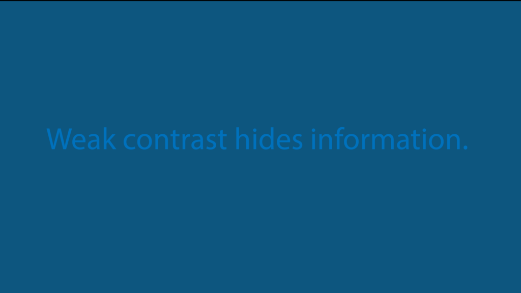
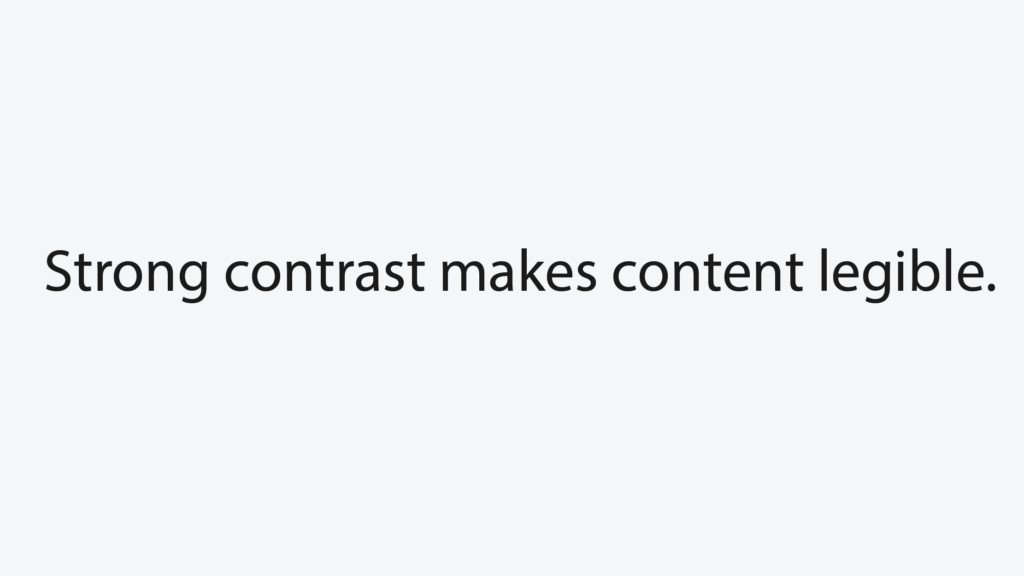
Issue
A combination of foreground and background colors that’s difficult to read because of a lack of contrast (ie. light gray text on white background)
Who’s affected
People with low vision or color deficiencies
WCAG standard
Guideline 1.4.1 Contrast (minimum),
What to do
Elements in the Forty-two design system will have accessible levels of color contrast in their default state. If you change the foreground (text) or background color of an element, make sure the color contrast is 4.5:1 or greater. (There are some exceptions and variance around logos, decorative elements and large text. Check with C&M if you’re unsure)
Recommended tools
-
Heading hierarchy
Issue
It’s not uncommon for people to create headings by just selecting a piece of text and making it bigger and bolder in the editing toolbar. This seems innocent enough, but it plants the seeds for a cascade of accessibility and usability problems.
Who’s affected
People who use screen readers to access the web (blind, low vision) and ask the screen reader to read all the headings on a page, people who navigate by keyboard (hand mobility issues) people with cognitive disabilities.
WCAG standard
- Guideline 1.3.1: Info and Relationships
- Guideline 2.4.10: Section headings are used to organize content
What to do
Use the headings available in the text formatting tools of your editing software (Heading 1-Heading 6) to organize content on a web page in an outline-like order. Your page title will automatically be a heading 1 in our system, so identify your main topics with heading 2s and any sub-topics with heading 3s, etc.
This helps all users understand what the page contains with minimal effort. Nest headings sequentially (h3’s should be subcategories under an h2, for example) and don’t skip levels.
TIP: If you’re working in Word or Google Docs, turn on “outline view” to see your document’s heading hierarchy.
Recommended tools
- Outline view (in Word and Google Docs)
- Accessibility Insights extension (available for Chrome & Edge). To see the heading structure on a live web page, use the “Ad hoc tools.”
-
Link text
Issue
Link text that doesn’t give the user any information about where the link goes, such as here or click here is meaningless when read out of context. Same goes for linking a page url or a file url. (ie: https://accessibility.engin.umich.edu/post.php?post=272).
Who’s affected
Screen reader users who ask the screen reader to read all the links on a page, also non-disabled users who are scanning the page.
DO
- If you know their name, go to MCommunity
- If you know their department: Go to the department website and visit the People section to find them.
- If you know what office they’re in: Try the Engineering phone list.
- If you’re still not sure: Check the Engineering org chart on the University’s SPG site.
DON’T
- To go to MCommunity, click here
- To go to a list of Department websites, click here.
- To go to the Engineering phone list, click here.
- To go to the Engineering Org Chart, go to https://spg.umich.edu/org-charts/210000
WCAG standard
Guideline 2.4.4: Link Purpose (in Context)
What to do
Write link text that describes the destination or purpose of the link. (ie. “Please take our admissions survey” (link is just for demo purposes, does not go to a survey)
Recommended tool
This one requires your judgement!
-
List formatting
Issue
A group of more than two related items is presented in paragraph form, separated by commas or is presented as a list but not marked up (coded) as a list.
Who’s affected
People with cognitive disabilities, screen reader users and anyone scanning the page. The bulleted or numbered (depending on the list) structure conveys meaning and helps the user focus.
WCAG standard
Guideline 1.3.1 Information and Relationships
What to do
Use the bulleted or numbered list styles available in the text formatting tools of your editing software to designate the items as a list. If your items must be in a particular order or ranking, use a numbered (ordered) list. Otherwise, use a bulleted (unordered) list.
Recommended tools
WAVE accessibility checker – Use the structure tab to see if a list is actually marked up as a list.
Find more tools and guidance at accessibility.umich.edu, the university’s repository for digital accessibility knowledge.