The WebAIM color contrast checker includes an eyedropper tool that lets you sample colors from a graphic or image before you upload it to the web. Use it to make your graphics accessible before you finalize and share them.
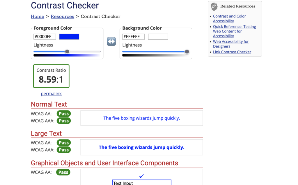
Color contrast ratio comes from comparing the relative luminence of the foreground and background colors. The checker will produce a numerical ratio, and that ratio needs to be 4.5:1 or higher to meet accessibility standards for most text.
Large text – 14 point (typically 18.66px) and bold or larger, or 18 point (typically 24px) or larger – and graphical components that people interact with on a web page (like buttons or form borders) need to have a contrast ratio of at least 3:1.
Just going to do a quick demo of the WebAIM color contrast checker to sample the color contrast from a graphic. So I have up here just a png image. It’s not embedded yet in a website. And I’m going to check this section here to make sure this background and this foreground have a contrast ratio of at least four and a half to one. Yeah, four point five to one, which is what WCAG double-A requires.
So uh foreground color is white. I just happen to know that so I’m just going to key it in.
And as soon as you click off of that it gives you white. The background color I’m going to sample, so I’m going to click in the color block, select the eyedropper, and grab the lightest spot next to that.
Now it won’t actually register the color until I close that picker. As you can see it is just a shade light. Four point four seven to one is not quite enough contrast but you can use the slider to give you an idea of how much darker that image needs to be. The answer is not very much because I just barely budged it and then it moved up [to an appropriate contrast] so this needs to be darkened a little bit and then its contrast will be a-okay.